Friday, 18 March 2011
Finished
So now i have finished my music magazine and i have finished my blog. Hope you enjoyed it, thanks for all your lovely comments.
Friday, 11 March 2011
Evaluation
The second part to my evaulation
• Who would be the audience for your media product?
The audience for my music magazine would be aged from 15 to about 19 or 20. They would be of both genders., i don't want to discriminate. They would be teenagers, who enjoy music of indi pop, pop, country pop and alternative rock genres. Who also like to keep up to date on news of their favourite bands and solo artists.
• How did you attract/address your audience?
I attracted my audience by appealing to what they would want in my product. Since I am within the age range that I have decide to target, it was easy for me to ask around, using both my social time as well as polls or questionnaires on my blog. I used colours that would appeal to my target section of teenagers, as well as wording the magazine in a way that would not be complicated or hard to read, for example, like a period novel. The pictures I took included people of the same age, they also included both genders. I didn’t want my audience to be secluded to just males, or just females. The content of my magazine was made to appeal to both genders as well, not including girl gossip pages or in depth information about heavy metal. I didn’t want my magazine to be a stereotypical magazine. I wanted it to break the barriers and be an entertaining, interesting and informative magazine. Someone would want to buy my magazine because of the interesting content.
The hook of my magazine is my front cover and i took a lot of time making sure that this was attractive and eye catching. 70% of people buy magazines on the spur of the moment. I wanted my magazine to stand out from the rest. so that more people would buy this magazine on the spur of the moment.
• What have you learnt about technologies from the process of constructing this product?
The technologies that I have used are Microsoft Publisher and Microsoft Word, Gimp, a digital camera, Blogspot, polls, PowerPoint and Vlog. I have learnt that to use some of these programmes and technologies you have to have certain knowledge. I have had fun using these technologies and i thought that by using them i could make my magazine...just more than it would be without them.
• Looking back at your preliminary task, what do you feel you have learnt in the progression from it to the full product?
I felt I have learnt a great deal. Both about the way a product is molded to fit it’s target audience’s needs as well as how difficult it is to make a professional appearing magazine within a period of time. I have gained skill and knowledge in how to edit a photo using Gimp. And I have also gained knowledge about keeping and maintaining a blog. I felt that I have learnt a great deal that could be beneficial for future use.
Final Pages
Okay so here are my final pages. I have taken into account the audience feedback i received and made some changes to suit the feedback. I hope you like them, enjoy!


Monday, 7 March 2011
Audience Feedback
Okay so i have posted my 'final' pages of my music magazine. However i know that audience feedback is the best way to improve something. Because of this i have thought of a few questions that would benefit myself and the magazine if you would answer them please. Thank you.
Is there anything you would like to see changed about the magazine as a whole?
Do you have anything to say about the text? Is it the correct size, font, colour ect.
Are the pictures of good condition?
Do you like the pictures i have chosen?
If there are any other points that you have concerns about or would like to see changed please comment and let me know.
Updated Music Magazine Pages
So...here are my 'final' music magazine pages.
While i was going through these and my older posts, i couldn't help but notice that i haven't stuck to the colour scheme that i had thought through. Instead i have used red, white and black. If you count the photos then i have also incorporated green. Looking back i now think that this colour scheme is better.
My front cover
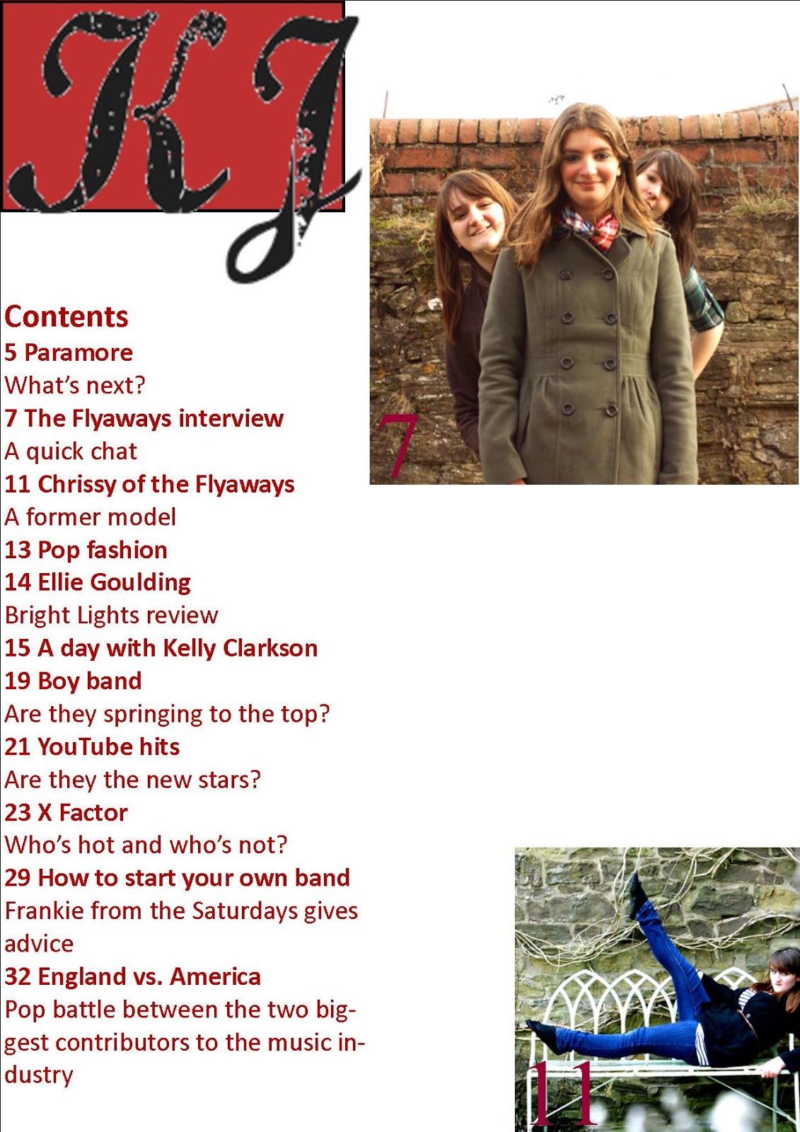
 I created two contents pages because i wanted my magazine to give my target audience their moneys worth. Also i needed room for an editorial, which i didn't have on my first contents page.

For the second contents page...

While i was going through these and my older posts, i couldn't help but notice that i haven't stuck to the colour scheme that i had thought through. Instead i have used red, white and black. If you count the photos then i have also incorporated green. Looking back i now think that this colour scheme is better.
My front cover

I have changed a few things with my front cover. I have taken the feedback that i received from when i posted it and have taken it into consideration. I have changed the colour of the Masthead so that it stands out more. I have also removed the boxes (they weren't supposed to be there in the first place, they were just a guide for myself). I have changed the colour of the text at the bottom of the page so it can be read. I have added the issue number, the amount of the magazine and the date. I removed the 'plus added features' because it sounded corny and not professional. Overall i have improved the appearance and presentation of my front cover.
My contents pages
 I created two contents pages because i wanted my magazine to give my target audience their moneys worth. Also i needed room for an editorial, which i didn't have on my first contents page.
 For the first contents page...
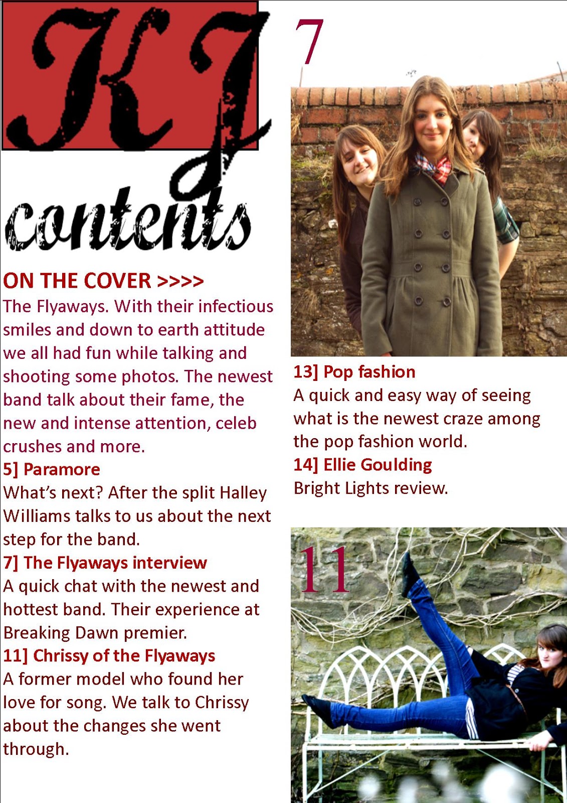
I have changed the contents page by; changing the KJ. I have changed the colour behind the text and also the transparency, i have also strengthened the black of the text. I have put columns in, so that it looks more aesthetic and i have written more for the 'On the cover' and generally for each contents of the contents. I thought that this looked more professional that what i had originally put. I have also made the pictures bigger.

For the second contents page...
I have continued to use the Masthead i have used the same font for the contents. I have kept the font of the other text the same as well as the colour of the font the same as well. On this page i have included my editorial. I wanted to put it onto my first contents page but i had no room. So i created another one so i could have an editorial. Also, most magazines nowadays have more than one contents page. I thought that if my magazine has so many pages then it needs to have two contents pages to show them. I have made a mistake...the page number on the photo is the wrong one! It's meant to be 23. I will change it for my final one. The space between the editorial and the bottom section of the contents will be filled with a photo.
My double page spread

For my double page spread i haven't changed as much as i have for the others, however i think this is good because it means i did this quite well the first time.
I have put in the paragraph above the interview. I have also put in a page number, which also goes with the colour scheme. I haven't put one on the opposite page because of the title and also because there is no space. i have moved the text boxes and changed how much writing is in each one. i have also changed the font size so that i could fit my text in. i have also put in the 'Exclusive to KJ', this makes it look as though this article is something you can only find in KJ and not in any other magazine.
I have also made a few changes whilst i was writing this. I will post the final versions when i have received my audience feedback.
Monday, 14 February 2011
Second Contents Page
 Okay, so i have been a busy bee and i have pulled off a second contents page. This one is so that i can have an editorial in my magazine, without cluttering up my first contents page. I have changes the contents so that the titles of the articles are in red and the information below is in a different colour, a burgundy red. There will, of course be more photo's i just need to take them. My next 'draft' of these that i will post will be my final ones, except for any final touches i need to make due to my audience feedback.
 My editorial...
"Hey, so another issue of KJ. I have to of course, thank the wonderful team who helped to put this together and praise them for the masterpiece of a magazine. I’m sure you would agree. Thank you for picking KJ, until next time!
Jade"
Thanks for everything!
Thanks for everything!
Double Page Spread

This layout is my favourite out of the three that i have already done. I like the picture in the background, and the way that i have put a background of half transparent colour behind the text. Making the text stand out and easier to read.
The colour scheme of my magazine had been carried through because the title is in the same colour as that of the Masthead and the magazine cover lines.
Some improvements...
There is a space that is empty at the bottom of the last box, and i have got rid of it by shortening the box length. I have also made the questions bigger, they are now in size 11.
I have also just written a opening to this article. This will be located above the first part of the article.
"The hottest new band open up and tell us what’s it’s like to so suddenly be famous and what the premiere of Breaking Dawn was like. The girls invited me into their beautiful home and we talked till the sun went down. They are all down to earth girls who get along with anyone, for once, fame doesn’t mean anything to them except the chance to make the music they love."
If you guys could give me some feedback i would love you. I will be posting an audience questionnaire maybe at a later date once i have gone over my work again.
Friday, 11 February 2011
Contents Page
This is a look at my contents page. It is better an i thought it would be.
 I still need to put together some other pictures of other bands or artists to fill the spaces. However the overall layout of my contents page is okay. I have included a varied contents and the pictures will be varied as well, one of the Flyaways, another of another band and i have a picture that i will use for the one story in my magazine. The story is that Chrissy has a background in modeling.
Now looking at it, the numbers on the pictures could be a different colour becuase you can't really see them. Also, the word "industry" has been cut into two. It doesn't look professional so I'll change it for my final one.
Now looking at it, the numbers on the pictures could be a different colour becuase you can't really see them. Also, the word "industry" has been cut into two. It doesn't look professional so I'll change it for my final one.
Monday, 7 February 2011
Article for Double page Spread
Okay, so this is the article that i will be using for my double page spread. Because when i post my finished piece the writing will be small i thought you should enjoy the chance to read it.
How did you get together?
Eve “Well we’ve been friends since school and have always wanted to be a band.”
Sarah “Yeah it first started out as a joke you know. But then we actually thought why not?”
Chrissie “We recorded some songs, made a CD and sent it to a recording company who were working alongside our school and they loved it.”
When did you first think of the name?
They burst out laughing.
Sarah “Well it was kind of by accident really. We were just throwing ideas around.”
Chrissie “And we had the radio going and the song ‘flyaway’ came on and we were all singing along.”
Eve “Then we all stopped and just shouted, “The Flyaways!”
How do you decide on song lyrics?
Chrissy “Well when one of us has an idea they write it up and then we talk about it. It’s informative but at the same time we gossip and just talk.”
Eve “If the lyrics don’t really…flow first time around we go over them.”
Do you have a celebrity crush?
Eve “Umm…probably Kellan Lutz.”
Chrissy “(Laughing) Most defiantly Taylor Lautner.”
Chrissy “(Laughing) Most defiantly Taylor Lautner.”
At this all the girls laugh.
Sarah “It would have to be Charlie Simpson.”
What’s your ideal date?
Sarah “Maybe a walk on the beach, a picnic would be nice with strawberries.”
Chrissy “Oh God umm…theme park or going to the beach. If we went to the beach I would take y dog, he likes the beach and I’d want to see if he was a dog person.”
Eve “I would love to have a nice dinner and a quiet walk afterwards, just talking and getting to know one another.
Any tours coming up?
Sarah “No, but we are considering doing one after our next album.”
Eve (laughing) “Yeah, we were a little blown away at the response we got from our first album. We thought about it and decided to wait until we have more than just a few songs to sing on tour.”
What did you do before being a band?
Chrissy “Working as a bar maid, you know, serving drinks and everything. It was a good job and I liked it.”
Eve “I used to be waitress at the local cafe. It was tough but it helped me get by.”
Sarah “I had a job at HMV, it was fun and I got to listen to music all the time so I was happy.”
Who comes up with the songs? Is there one person, or do you all write the music?
Eve “We all co write them all, some are written by only one person.”
Sarah “There’s one song on the album, Recent Reminders that Chrissy has written the lyrics to and composed the music.”
Chrissy “The song was about a past relationship that went wrong and when it ended I had…well an epiphany. And I wanted to share it with others. So I sat down one day and just started to write.”
What’s your favourite food?
Eve “Pizza has to be my favourite, cheese pizza.”
Sarah “Umm…Chinese food, defiantly. The shop down the road has the best prawn chow meine.”
Chrissy “It would probably be Italian food for me, I love anything Italian.”
How was the movie premier?
Sarah “Meeting all of those stars was just mind blowing. I couldn’t believe I was actually there, I actually had Chrissy pinch me once or twice.”
Chrissy (laughing) “Yeah I think we were all stunned at where we were but it was great. Breaking Dawn was amazing!”
Eve “It was really weird getting to walk on the red carpet. I mean, you hear about these musicians who get to see these great movies and then we were in their place! It was bizarre!”
How did you make the decision to let your music be used in a new film?
Sarah “Well we were approached by the producers and afterwards we talked about it late into the night, but we all agreed that we would let them.”
Eve “
Did you meet any of the stars?
Chrissy “It was a bit weird meeting your idols. Along with our growing popularity and the fans were actually screaming our names…that was a little scary to say the least.”
Is being famous weird?
Eve “Yes. When you wake up in the morning and we find out we need milk we draw straws to see who’ll go. None of us want to be followed by the paparazzi and fans.”
Do you find the attention annoying?
Chrissy “Most of the time we hardly notice it. But when you have screaming fans running after you in the local Asda, it’s a little scary.”
Sarah “Yes, absolutely.”
Are you moving on to another album?
Sarah “Yes, this will be our second one.”
Towards the end the answers get shorter but that is only becuase these were filled with a lot of information and i had run out of space on my pags to put the article. So i had to down size it slightly.
Friday, 4 February 2011
Edited Photos-just a sample
These are my a sample of my edited photos. Hope you like them! These will join the three that i have already posted for my magazine, although i will have to chose which makes the final cut.


First layout design-front cover
This is my first design of my front page. Please, if you have the time can you comment about it please? 
Obviously you wont be able to read the text when the image is this small, but you can still get a sense of what it would look like.

Friday, 28 January 2011
My Photo Shoot
My Photo Shoot
Just a note...my edited photos might not be apperaing on my blog until monday at the lastest. As i have a lot of photos to sort through and edit. Thanks.
I took some photos with Chrissy last weekend, and I like the feel of these photos. For a change England's horrible weather was actually a beneficial factor for our shoot. The look that the gray, overcast Sky's gave us a sort of...twilight feel. It gave us the soft lighting that really made the pictures. Out of these pictures i might use one for my front cover, however, they are meant to be together in a band. So it might not feel right just using one of them for my front cover.


I also took some photos of Eve and Sarah this week, as well as with Chrissy for a group shot. I'm not going to post them yet becuase i can't put them onto my computer as of yet becuase of technical faults. However, they will be put onto my blog on monday.
Monday, 24 January 2011
Planning my photo shoot
For my photo shoot i will be taking a good range of photos for my magazine. This way i can play around with different photos.
I have already taken spome photos of Chrissy and like these very much. I am also going to take photos of Eve and Sarah as well, together, these three will make my new band. Who i am going to interveiw for my magazine.
So...to be really organised i have planned out what i am going to on each day. (Hopefully i will stick to it)
Today
Finish off any work that still needs to be done from last week
Plan my photo shoot
Sort out what photos i want that i have already taken of Chrissy
Tuesday
Take photos
Wednesday
Edit photos
Thursday
Edit photos
Friday
Put edited photos on my blog
Layout Designs


I have been thinking about these and i have many ideas, some that i can't get out of my head.To the right is my first idea of a front cover layout. The Masthead, however is my first design of it. The block colour behind the font is like Q's Masthead, but i added the detail of the tail of the j, dropping below the box. Overall, i think this layout will work. If i use a picture that will take up all of the front page and wont be to obstructed by the coverlines and the Masthead.
For a rough draft i think that this is working well. So far as i can see if i use these basic outlines then everything should fall into place when i start to assemble my magazine.
The picture on the right is my first layout design of my music magazine's contents page. I like the use of my masthead, but in a faded grey. It continues my magazines brand identity and makes use of the space above the contents.
Hopefully this layout will work. The pictures could be a shot of the new band that the main article is about, the other smaller picture could be another story.
These are very rough, and have no colour or definition, but when i am finished they will look amazing.
By the way, I'm no longer going to be doing weekly reviews like my action plan said. I takes up time that could be used to make this magazine better. I will be writing to talk about my magazine, but not in great length.
Friday, 21 January 2011
Colour and font Analysis
 I have tried out many different font types but these were the ones that stood out for me. I think that these are different and aesthetically pleasing. They are all in black as a basic colour, but now that I've looked at them, they look quite dramatic and bold in black. I've looked over them and i am leaning towards using the top, second from top and bottom at the moment.
 I like the top font because it gives off a vintage feel, the feel i would like for my music magazine. It's aged as well, the writing looks like those old photographs you see.
The second font i like because the first letter is in lower case and the second is capitals. I did this on purpose because i thought it looked better than if both of the letters were capitals. The overall look of them is okay. It doesn't hit me in the face and make me think...wow, but it does draw my attention a little i have to admit. I don't think i will be using this font.
The third however is more decorative than the rest. It's more like a tattoo than text you would see on a magazine, but the words are eye catching and nice to look at. These draw in my attention and they do make me think wow. But a down side is that the font is a little too decorative and it takes away from the fact that this is text and no an image.
The fourth is simple. The letters are think and not thick like you would see in, for example bubble writing. To me, this font is laking anything that makes it stand out.
The last one is decorative but not as much as the third one. And again, the font is more like an image than text. at a quick glance it is hard to make out what the letters are. But, the font is very beautiful and has the elegance i want for my magazine, maybe a little too much elegance.
What about you? I would love to hear what you think if you just leave a comment. Thanks.

The letters have been used because KJ stands for Kicking JukeBox.
Opposite is my colour chart. These are the basic colours that i will be using in my music magazine. The main reason why i chose these is because of they are simple colours and aren't too bright or vibrant. I like the coolness of the colours, the way that they all merge together and don't jump in your face. The way that my magazine is designed and set out should reflect a laid back and relaxed feel.
These might not actually be the colours that i am going to use but they are similar to the colours i will be using. I wanted my magazine to be fresh. The genre of my music magazine is indipop and alternative rock because using these types of genre, my target audience is more spread out and more people can enjoy my magazine.
Monday, 17 January 2011
The Treatment Sheet
The Magazine: KJ aka Kicking JukeBox
Target Readership: KJ is the new magazine that offers its target reader, aged between 15 and 18 but the magazine may also be read by younger or older readers as well because of what they find interesting in the magazine. The readers of KJ might be able to provide their own source of income so that they are able to pay for the magazine. However if they can’t then the price is low enough that they could borrow the money from parents or guardians. I am keeping the price low, £2.00. KJ readers have grown up with the help and support from adult figures to grow and learn. With this support from older authority figures they have grown up with examples always being set for them. So the target audience is mature, but at the same time want something fresh and new. The KJ reader is one who enjoys music and topics surrounding music.
Form and Style: KJ is an A4 full colour magazine which contains interviews and gossip from and on bands, artists and new bands, also reviews, fashion and new albums. Covers use colours such as blues, greens and yellows. On occasion, KJ will feature famous artists on the front cover; these will be female role model such as Hayley Williams. Cover lines show the magazine to be vibrant and contemporary, talking about facts, gossip and news such as new bands. They will also include details of special offers and competitions such as winning backstage passes to a concert. Graphics used are bold and catchy and the cover will not be cluttered but nevertheless have the feeling that you will be getting value for money. The magazine will sell at £2.00, an average price for a music magazine that will include such features as interviews ect.
Themes and Typical features: KJ will have many regular features typical to that of music magazines. For example every issue will include CD reviews and an interview with someone from the music industry. KJ will also try to round up celebrity musician news, as well as reviewing the latest music, music videos ect. The writers will use language familiar to the target audience to make the magazine as useful and interesting as possible.
Potential advertisers: A range of bands will use the magazine as an opportunity to advertise for up coming concerts or new CDs. As well as advertisements such as perfume or fashion, for example, Vans.
Editorial Team: The editorial team for KJ will be made up of experienced writers and designers. The team will be made up of a range of men and women. Most of the magazine will be written by them, however readers of the magazine will also regularly be asked to contribute their ideas such as opinions on latest albums. The aim of the team is to bring fresh ideas to the target audience whilst also giving them the information and facts that they will receive from the magazine as a whole.
Friday, 14 January 2011
Weekly Review
Okay, so this week i have got a lot done.
I am happy that i have managed to do so much, this way i can start afresh with what i have to do next week that i have outlined on my action plan.
- I've finished my textual analysis of 3 magazines.
- I have found figures of music magazines about how well they have done in the past year.
- I have created a audience questionnaire and posted it, i have also received feedback on it already.
I am happy that i have managed to do so much, this way i can start afresh with what i have to do next week that i have outlined on my action plan.
Textual Anaylsis Vibe

Front Page
The masthead is very clear as it is in bold, black, which is clear to the readers. It is also spread from one side of the magazine to the other.
The lure of the magazine is the coverline in the right hand corner of the page. The difference between the Masthead and the title of the coverline is that the coverline title is all in lower case and the colour is yellow. The quote used in the coverline is interesting and the words chosen for it would draw readers in as they would want to find out what the story is about.
The graphics used is a simple pitcure of the singer Usher. The picture reminds me of the movie Top Gun staring Tom Cruize. This milatray look is quite popular and the relation to Top Gun might peek interest in readers.
The picture takes up the whole of the front cover and is evenly spaced. The colours used in the picture are also similar to the magazines colour palette.
The coverlines are small and all use the same colour yellow. This shows continuation in the layout and presentation.
The magazine's colour scheme is a simple, green, yellow, white and black. They have mixted colours so that they all work well to create the front cover that we can see.
ABC Figures for 2010 NME
Mag ABCs: NME down 17% as rock and film titles slump.
NME had an average weekly circulation of 33,875 in the six months to the end of June, according to figures released today by the Audit Bureau of Circulations.
Rivals to NME also suffered in a bad set of results for entertainment titles. Circulation of Bauer's Q Magazine dropped 10.7 per cent compared to the first half of 2009, taking it to an average of 89,450 per issue.
NME's sister title Uncut fared slightly better but still it fell with a 3.2 per cent year-on-year drop to a monthly average circulation of 74,067. Bauer's heavy metal weekly Kerrang! increased its average per-issue circulation by 1.8 per cent to 44,013.
Music magazines (percentages represent year-on-year change)
The Fly - 108,207 (0.4%)
Mojo - 91,678 (-6.2%)
RWD -78,867 (1.7%)
Uncut - 74,067 (-3.2%)
Classic Rock - 70,323 (0.0%)
Metal Hammer - 44,034 (-4.3%)
Kerrang! - 44,013 (1.8%)
New Musical Express - 33,875 (-17.3%)
These figures are from Press Gazette.
These figures show that when i make my magazine i will have to keep in mind how my magazine will circulate. If the figures of my magazine drop then i will have to keep it mind how i can rise them again. After looking at these figures i now know that if my magazine is kept at a suitable standard of quality then my target audience will be continually interested.
NME had an average weekly circulation of 33,875 in the six months to the end of June, according to figures released today by the Audit Bureau of Circulations.
Rivals to NME also suffered in a bad set of results for entertainment titles. Circulation of Bauer's Q Magazine dropped 10.7 per cent compared to the first half of 2009, taking it to an average of 89,450 per issue.
NME's sister title Uncut fared slightly better but still it fell with a 3.2 per cent year-on-year drop to a monthly average circulation of 74,067. Bauer's heavy metal weekly Kerrang! increased its average per-issue circulation by 1.8 per cent to 44,013.
Music magazines (percentages represent year-on-year change)
The Fly - 108,207 (0.4%)
Mojo - 91,678 (-6.2%)
Q - 89,450 (-10.7%)
RWD -78,867 (1.7%)
Uncut - 74,067 (-3.2%)
Classic Rock - 70,323 (0.0%)
Metal Hammer - 44,034 (-4.3%)
Kerrang! - 44,013 (1.8%)
New Musical Express - 33,875 (-17.3%)
These figures are from Press Gazette.
These figures show that when i make my magazine i will have to keep in mind how my magazine will circulate. If the figures of my magazine drop then i will have to keep it mind how i can rise them again. After looking at these figures i now know that if my magazine is kept at a suitable standard of quality then my target audience will be continually interested.
Textual Anaylsis Q Magazine
Q magazine
Front Page

The strapline is in white writing with a block black background, this makes the writing stand out. The strapline is also a promotional feature as it reads "The UK's Biggest Music Magazine", this could be an appealing feature for readers because through this they know that it is popular.
On the front cover there is a picture of the main story, Artists if the Century. The picture featured on the front cover is of the main story. This draws the reader into reading the magazine because of the interesting story. This is called a lure, using part of the main story to draw readers in.
The masthead is a simple one letter. The letter Q is an interesting choice for the title of the magazine. With the square red background it is classy and has a simple style about it.
The colour scheme of the front cover is red, white, grey and black. This colour scheme is bright and it attracts attention.
The brand identity of the magazine is clearly visible because of the layout and presentation of the front page. The masthead, Q, is always placed on the left hand side in the top corner.
The text is classic, smooth and easy to read. It's class adds to the over all professional edge of the magazine.
The magazine's cover isn't cluttered or full of coverlines, this means that the reader is automatically drawn to the main story and this could be a way of encouraging readers to buy the magazine.
The overall presentation of the cover is attractive and looks professional.
The overall presentation of the cover is attractive and looks professional.

Contents
The colour scheme is again red, white, black and grey. The continuation of the colour shows that the magazine layout has been thought through and carefully planned before construction.
The graphics on this page are limited but effective because of this simple design that the magazine has. They are around the same size and they offer an insight to what the magazine has to offer the reader.
The layout of the magazine is spacious and simple. It gives the reader a non cluttered page to look at.
The brand identity is shown through the use of the Masthead again on the contents page.
The pictures used are varied, for example the front cover is also on the contents page as well as a picture of someone who has been reviewed.
Monday, 10 January 2011
Textual Analysis Kerrang
Kerrang
Issue 1293
 Price £2.20
Contents
Double Page Spread The band Placebo are the main focus of the double page spread. On both of the pages is a picture of the band performing, I would think at the concert that the article is about. This draws the reader in and shows them a visual reference for the article, so that they aren’t just reading about it, but also seeing something to refer the writing to. The main part of the article is placed on the left hand side of the left page and is in a typical column layout. The writing is spacious and easy to read with the colourful background. This leaves room so that the text does not overlap onto the picture so much as to obstruct what the picture is showing.
 On the right there is also some short quotes from three people who went to the concert and their own opinion on the concert and the band. The layout for these are basic and include a picture of the person who the quote is from. The text is a basic black, just like the rest of the magazine, again this shows consistency within the magazine. However, the only colour within the double page spread is the lighting you can see in the picture, which is, green, white, red and purple.
Issue 1293
 Price £2.20
Sections in Magazine 7
Front cover
On the front cover there are a variety of cover lines, for example, artists names and band names that are featured in the magazine. The colour scheme for the magazine is black, yellow, red and white, you can see this because of the yellow black colour as a background for a strapline and also because a cover line is written in yellow writing. Red is also used as a background for writing in the shape of a circle, however black is the dominant colour.
The magazine includes posters and the cover lines mention them as well as other articles that are in the magazine. The magazine’s front cover is attractive because of it’s range of pictures and graphics used. The font and also the colours are used to make the magazine more aesthetically pleasing. The front cover is full of information, it's cluttered and it looks like the reader would get good value for money.
The Masthead is an onomatopoeia word, and suits the magazine type that it's used for. The sound 'Kerrang' is often said to be the sound made when strumming an electric guitar. The Masthead is written in bold and is also made to look like smashed glass, to further the feel of the 'hard' rock theme the magazine has.
The target audience, music lovers, will be more attracted into buying it because of the appearance. Within the magazine are other appealing features such as the inclusion of posters of bands, solo artists ect. The presence of the posters could be a factor which is taken into consideration when being purchased, because this magazine has posters then it is more likely to be chosen by a reader than a magazine which doesn’t include a poster and/or gift.
Contents

The contents page is spilt into sections or columns, this make the page more appealing to the reader as it is easier to read the different articles or headlines. The different columns are called names such as, News, Feedback and Swag. These common terms are familiar to the reader and therefore are easier for the reader to understand and relate to. The use of easy to understand language such as these are again appealing to the magazine’s young target audience.
The contents page again continues with the same colour scheme as the front cover, this continuation shows consistency within the magazine and that the presentation not only in layout but also in colour has been thought through.
It is interesting, but not uncommon to find the contents of a magazine to be placed underneath or even over a dominating picture on the page. The picture is often a major story or article within the magazine and therefore takes priority. The presence of a picture on the contents page usually peaks the readers interest to the story, kind of like an advertisement for that story. As with any magazine, the biggest and most popular story is first and usually takes up more of the contents than other stories.
Double Page Spread
 The band Placebo are the main focus of the double page spread. On both of the pages is a picture of the band performing, I would think at the concert that the article is about. This draws the reader in and shows them a visual reference for the article, so that they aren’t just reading about it, but also seeing something to refer the writing to.
  On the right there is also some short quotes from three people who went to the concert and their own opinion on the concert and the band. The layout for these are basic and include a picture of the person who the quote is from. The text is a basic black, just like the rest of the magazine, again this shows consistency within the magazine. However, the only colour within the double page spread is the lighting you can see in the picture, which is, green, white, red and purple.
Subscribe to:
Comments (Atom)